Bootstrap Grid System
Bootstrap Grid System , have a well define Grid System , which fit well across all devices , Check out Bootstrap Grid table here
Bootstrap Grid Component as below
- Container -Provide a ” container ” which is center position to hold the Grid System
- Row s – A wrapper for all column
- Content s – Reside in the Column
Column Break point are divided into
- Extra Small – .col-
- Small -.col-sm-
- Medium -.col-md-
- Large- .col-lg-
- Extra Large-.col-xl-
Sample Program
- First i create a HTML File using the bootstrap Starter Template . check out here
- Then I created a container
- Create a row
- and finally create 2 Column to be Resided inside the row
- Create some CSS Style , give the background , row and column some color so we can identified the difference
HTML
<!DOCTYPE html>
<html lang="en">
<head>
<!-- Required meta tags -->
<meta charset="utf-8">
<meta name="viewport" content="width=device-width, initial-scale=1, shrink-to-fit=no">
<!-- Bootstrap CSS -->
<link rel="stylesheet" href="bootstrap-4.0.0-dist/css/bootstrap-grid.min.css" >
<link rel="stylesheet" href="bootstrap-4.0.0-dist/css/bootstrap.min.css" >
<link rel="stylesheet" href="style.css" >
</head>
<body>
<div class="container-fluid">
<div class="row">
<div class="col-sm-6">First Column</div>
<div class="col-sm-6">Second Column</div>
</div>
</div>
<!-- jQuery first, then Popper.js, then Bootstrap JS -->
<img src="data:image/gif;base64,R0lGODlhAQABAIAAAAAAAP///yH5BAEAAAAALAAAAAABAAEAAAIBRAA7" data-wp-preserve="%3Cscript%20src%3D%22https%3A%2F%2Fcode.jquery.com%2Fjquery-3.2.1.slim.min.js%22%20integrity%3D%22sha384-KJ3o2DKtIkvYIK3UENzmM7KCkRr%2FrE9%2FQpg6aAZGJwFDMVNA%2FGpGFF93hXpG5KkN%22%20crossorigin%3D%22anonymous%22%3E%3C%2Fscript%3E" data-mce-resize="false" data-mce-placeholder="1" class="mce-object" width="20" height="20" alt="<script>" title="<script>" />
<img src="data:image/gif;base64,R0lGODlhAQABAIAAAAAAAP///yH5BAEAAAAALAAAAAABAAEAAAIBRAA7" data-wp-preserve="%3Cscript%20src%3D%22https%3A%2F%2Fcdnjs.cloudflare.com%2Fajax%2Flibs%2Fpopper.js%2F1.12.9%2Fumd%2Fpopper.min.js%22%20integrity%3D%22sha384-ApNbgh9B%2BY1QKtv3Rn7W3mgPxhU9K%2FScQsAP7hUibX39j7fakFPskvXusvfa0b4Q%22%20crossorigin%3D%22anonymous%22%3E%3C%2Fscript%3E" data-mce-resize="false" data-mce-placeholder="1" class="mce-object" width="20" height="20" alt="<script>" title="<script>" />
<img src="data:image/gif;base64,R0lGODlhAQABAIAAAAAAAP///yH5BAEAAAAALAAAAAABAAEAAAIBRAA7" data-wp-preserve="%3Cscript%20src%3D%22bootstrap-4.0.0-dist%2Fjs%2Fbootstrap.min.js%22%3E%3C%2Fscript%3E" data-mce-resize="false" data-mce-placeholder="1" class="mce-object" width="20" height="20" alt="<script>" title="<script>" />
</body>
</html>
CSS
.container-fluid{

   background-color:chartreuse;
   height:5rem;


}


.row{
    background-color:darksalmon;
    height:4.7rem;
    margin-bottom: 3px;


}


[class*="col-"]{

    background-color:coral;
    height:4.2rem;
    border: 2px solid rgba(0,0,0,4);


}
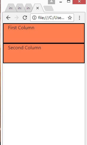
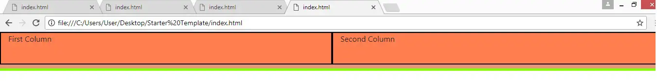
Output
Mobile Adjustable